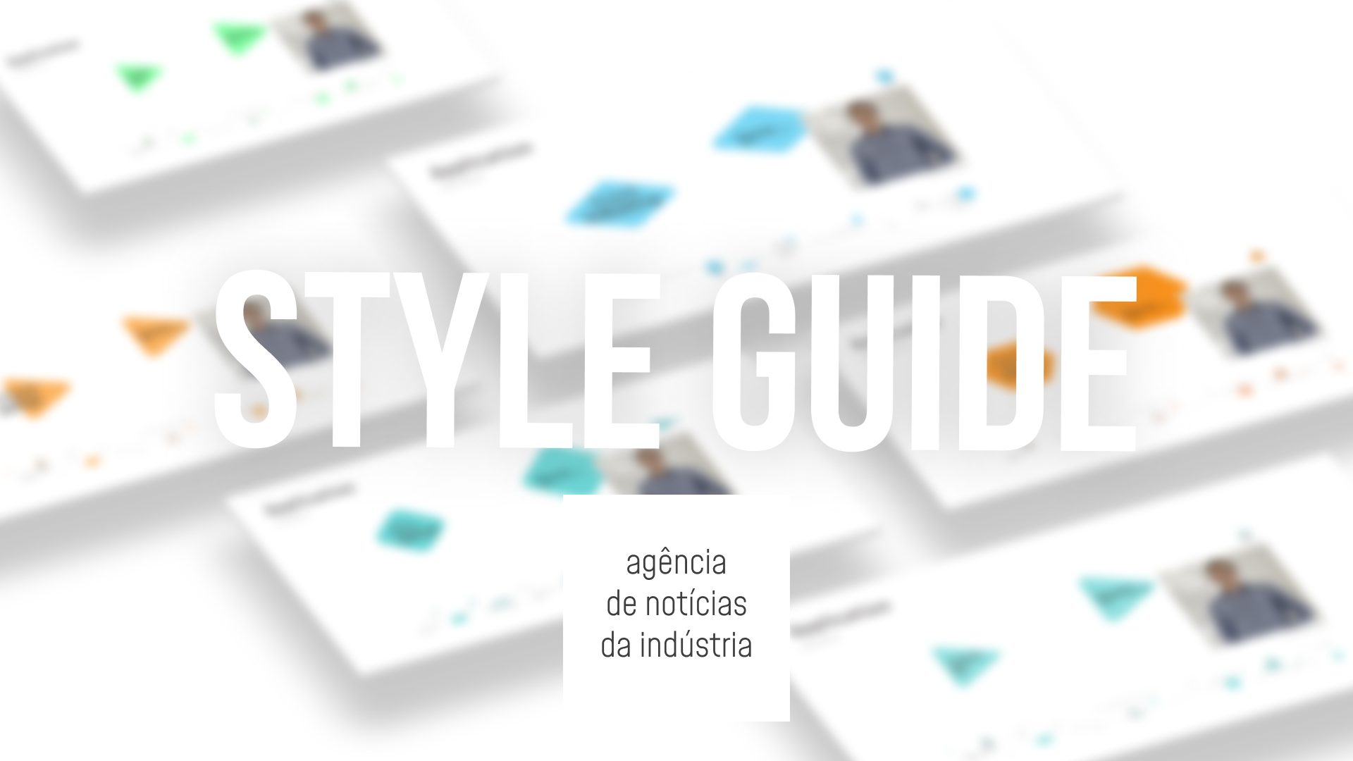
The challenge was to create a style guide for the Industry News Agency – without making a brand.
THE NO BRAND
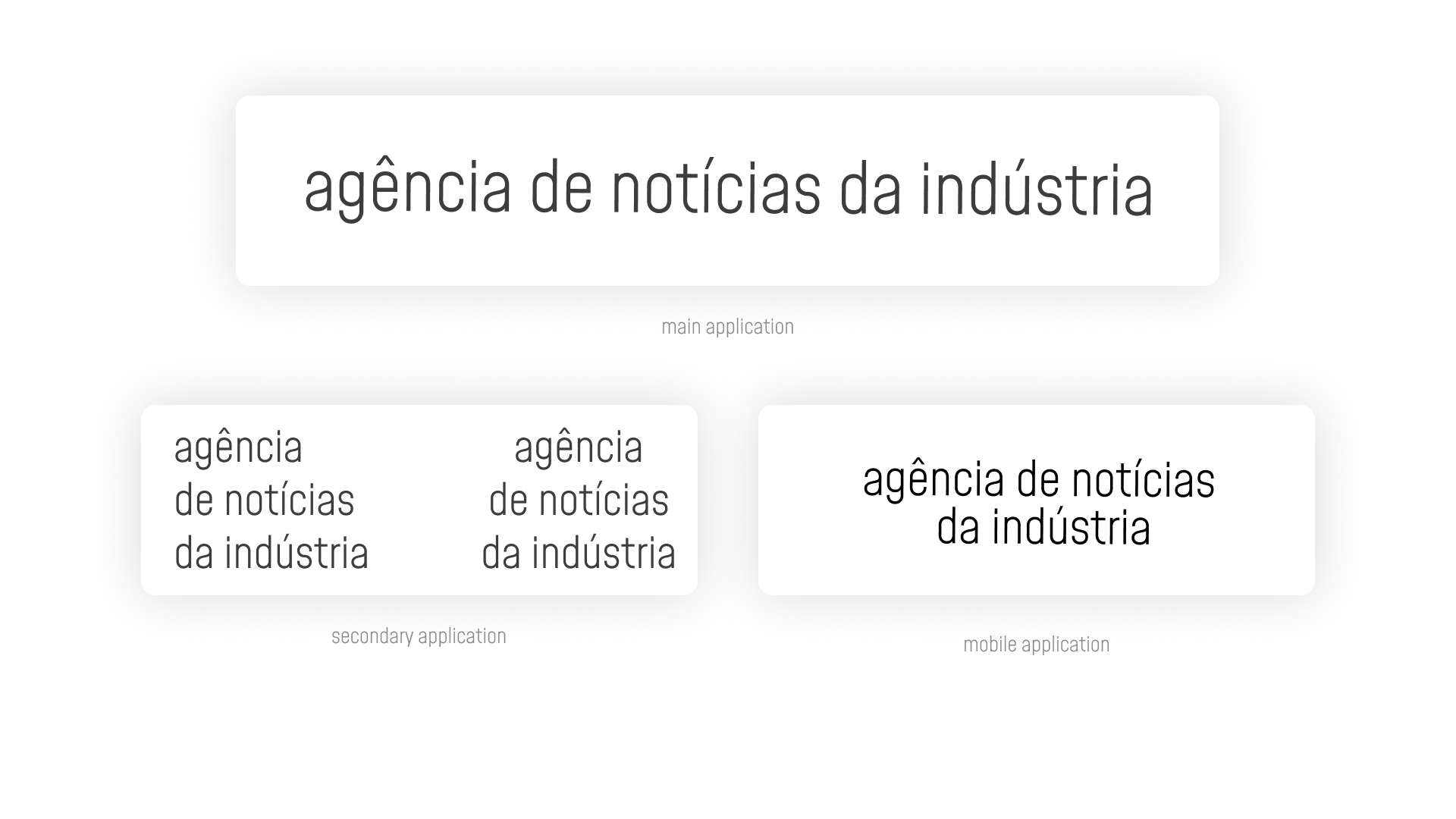
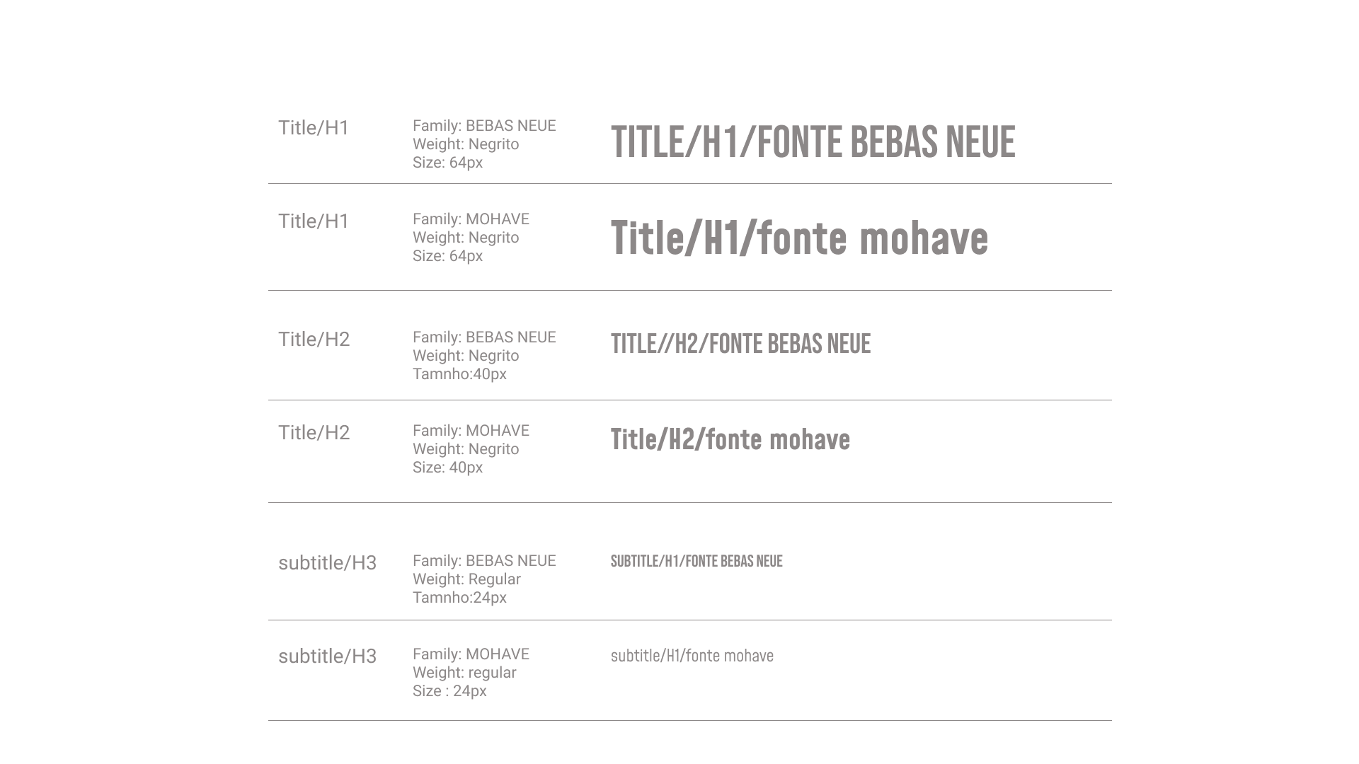
TYPOGRAPHY
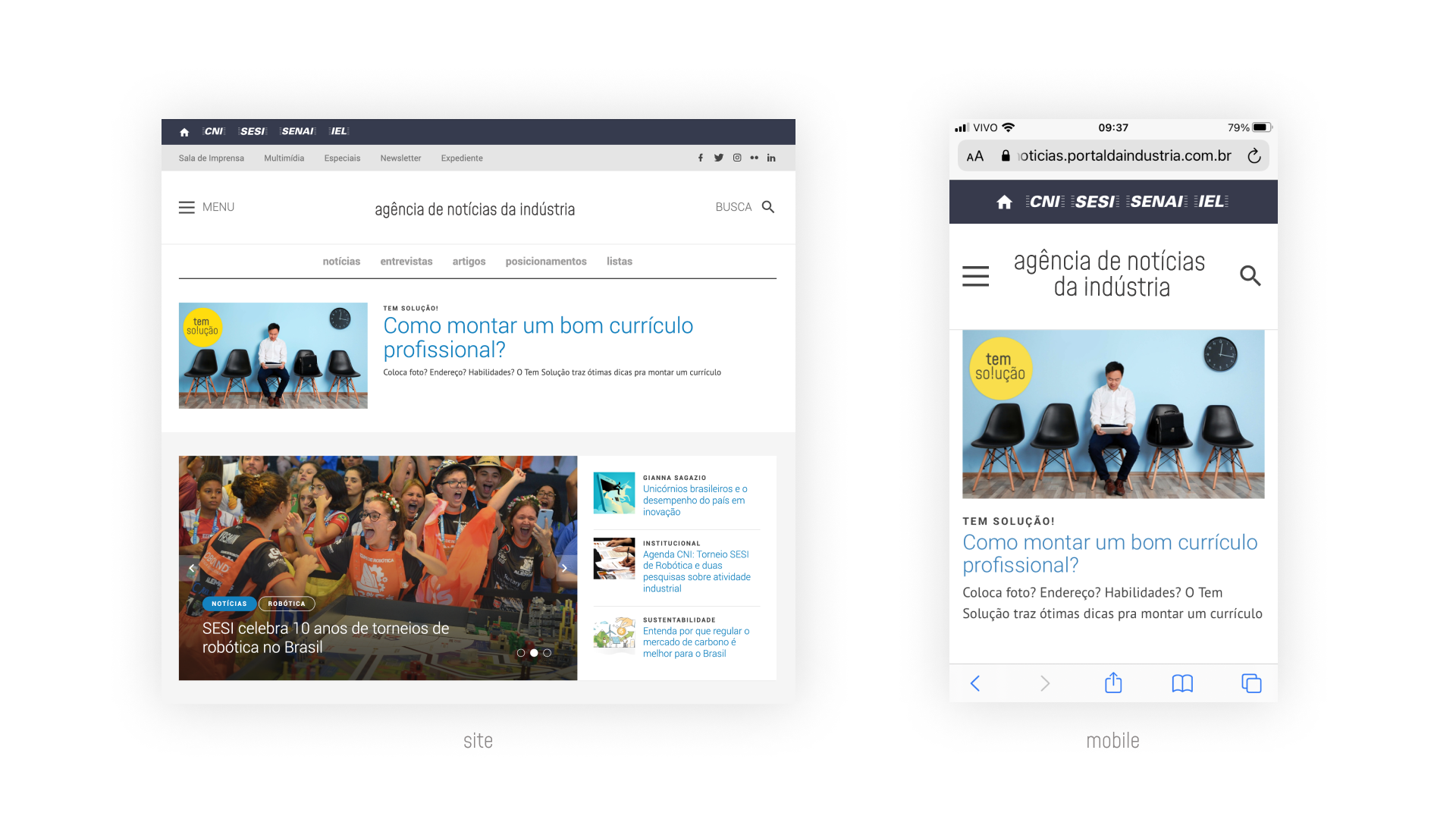
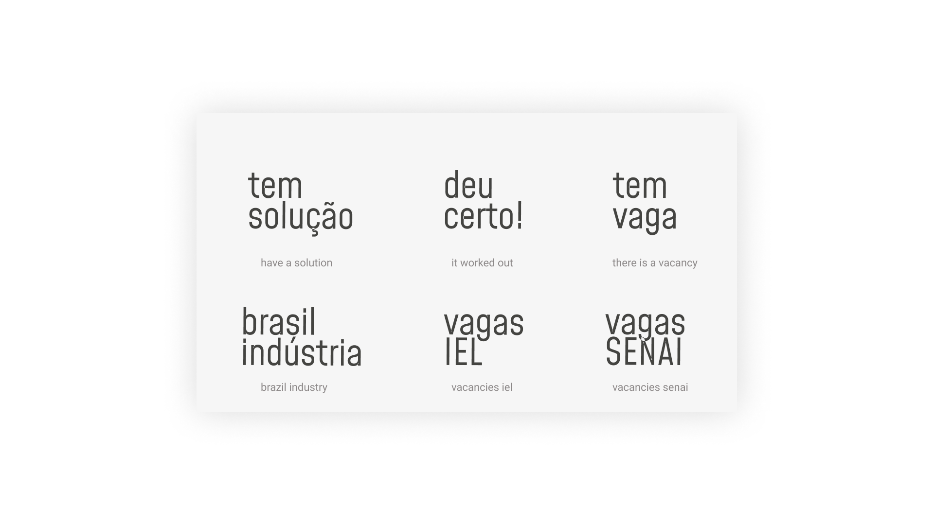
EDITORIALS
They have six editorials areas with different subjects bellow the same content, industry business.
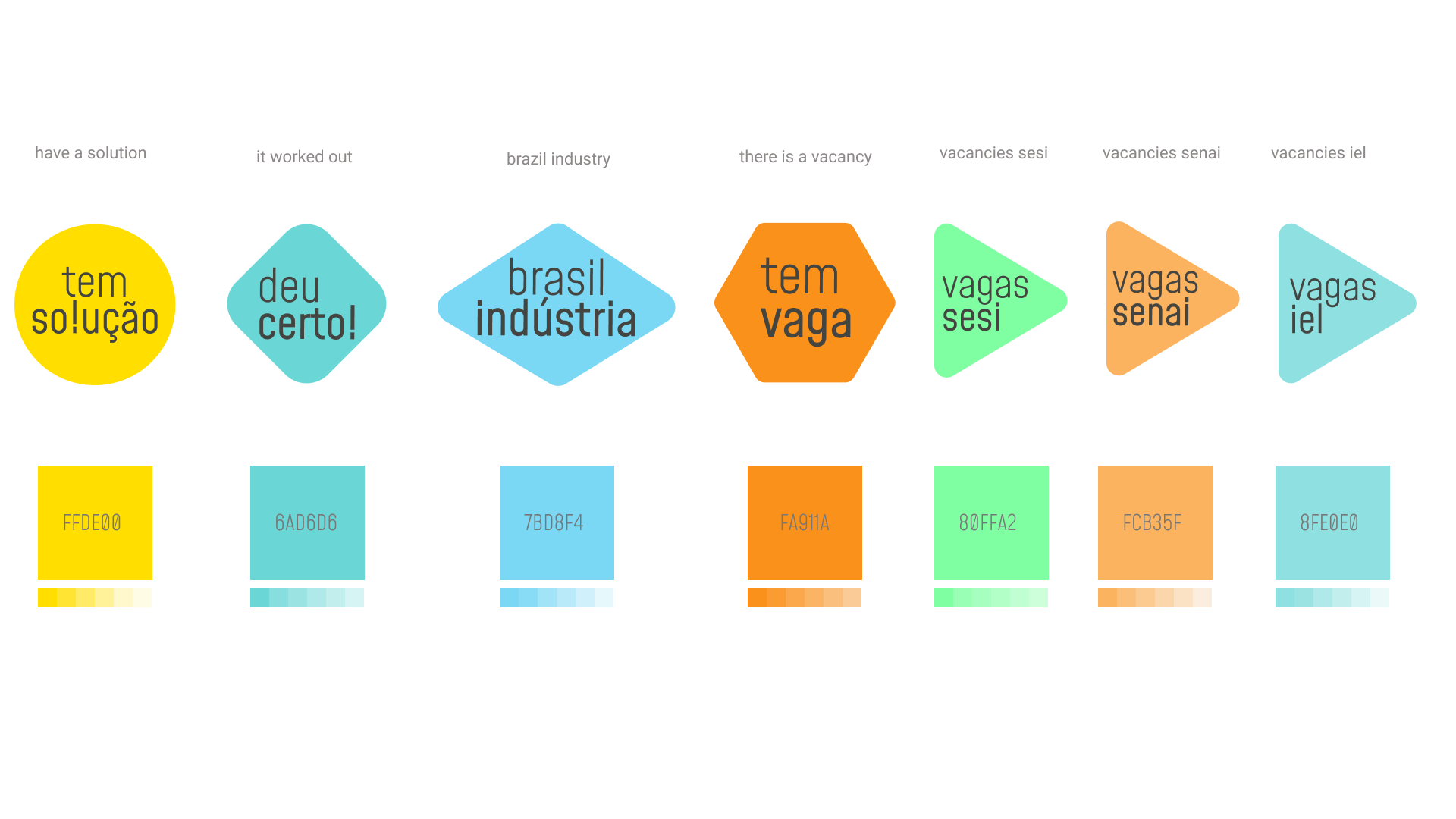
In the editorials we use a color palette system associated with geometric shapes to define the visual identity without the need for a brand.
VISUALS
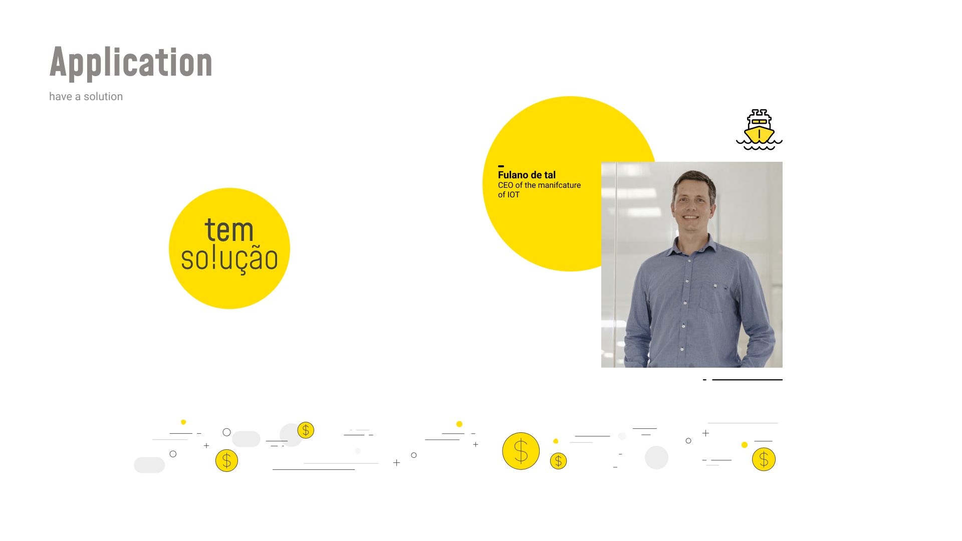
This is the images application created for each editorial.
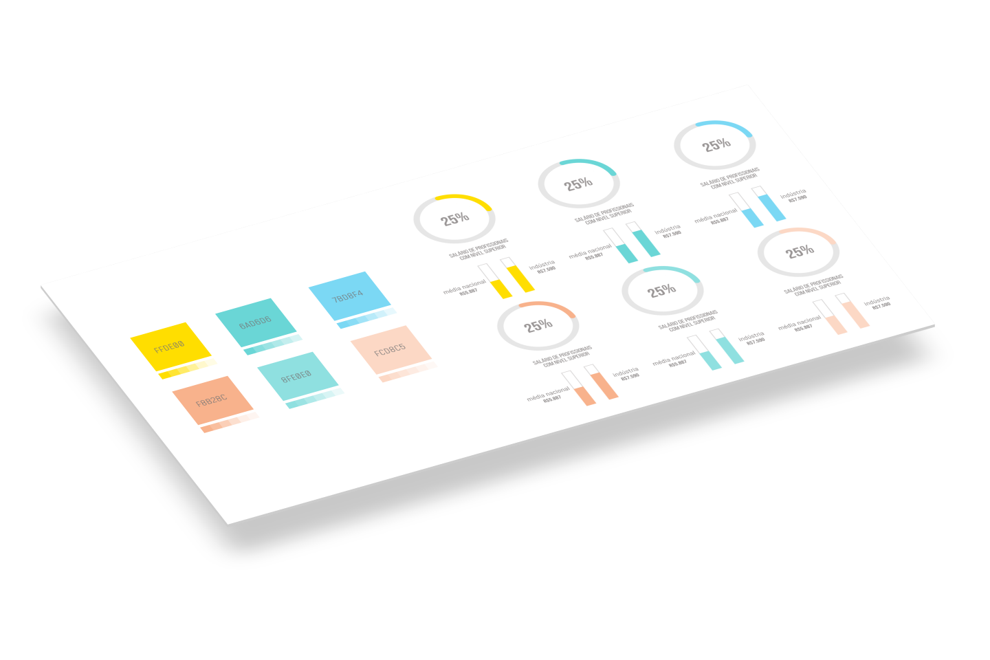
CHARTS FOR EDITORIALS
In editorials, we used the respective color palette to reinforce visual alignment.
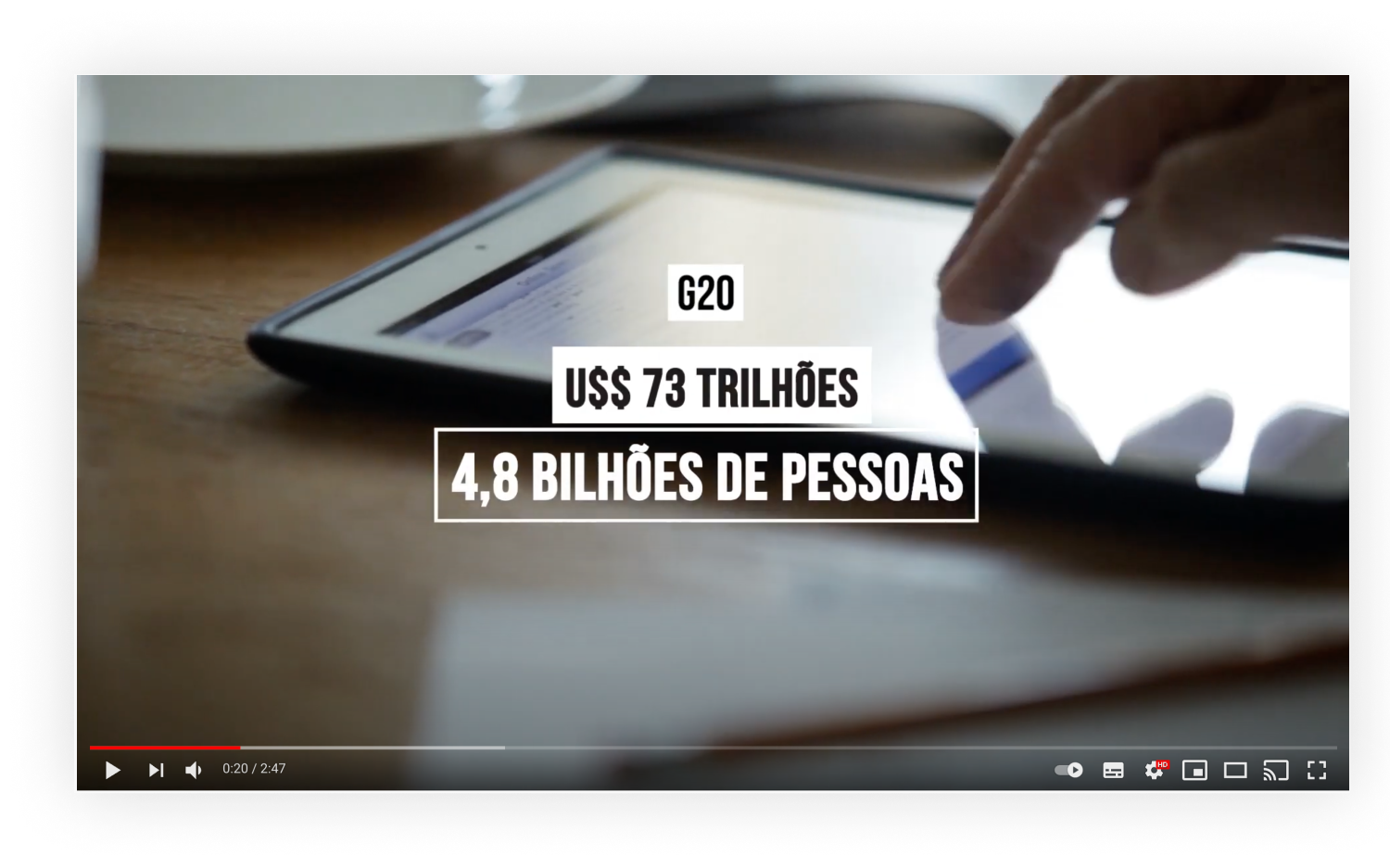
VIDEO TITLES
To keep the identity, titles goes with the Bebas Neue font in white without shadow.
For light backgrounds, we defined a blurred and distant shadow to favor readability.
LETTERINGS
The positioning of the letterings must change according to the framing of the video, mainly on the sides, avoiding positioning in the center of the screen, except for special cases.
OPENINGS
Fast opening to insert during videos presentation.